CASE STUDY
Spotgini Landing Page Redesign
Spotgini is a conversational interface builder for personal and work-related messaging. It uses A.I. to allow for custom conservations with people who are trying to reach you while you are not available
Their new feature, Firestarter, allows you to book an event with independent professionals or creatives, and crowdsource to gather people to pay and attend your event
TIMELINE
3 weeks
TEAM
UX Designer (me)
UX Design Intern
Engineer/Founder
SKILLS
UX Research
Data analysis
Ideation
Wireframes
Prototyping
Brand Identity
CONTEXT
I was originally tasked to make UI changes to the landing page, but I noticed that there were some usability issues that were not being paid much attention to in the onboarding flow.
I convinced our stakeholder to do a usability study with some users to create design changes backed by real user data, and in the process update the UI to make it more cohesive with the style guide I was already working on.
Problems
• Lack of content made it hard to know what the product is about
• 60% of users studied were hesitant to provide personal information in chatbot
• Outdated site made it harder to discover product info on the landing page
Goals
• Allow users to easily find product information and effectively develop trust to increase sign up rates
• Cleaner and consistent style that creates a smoother interaction
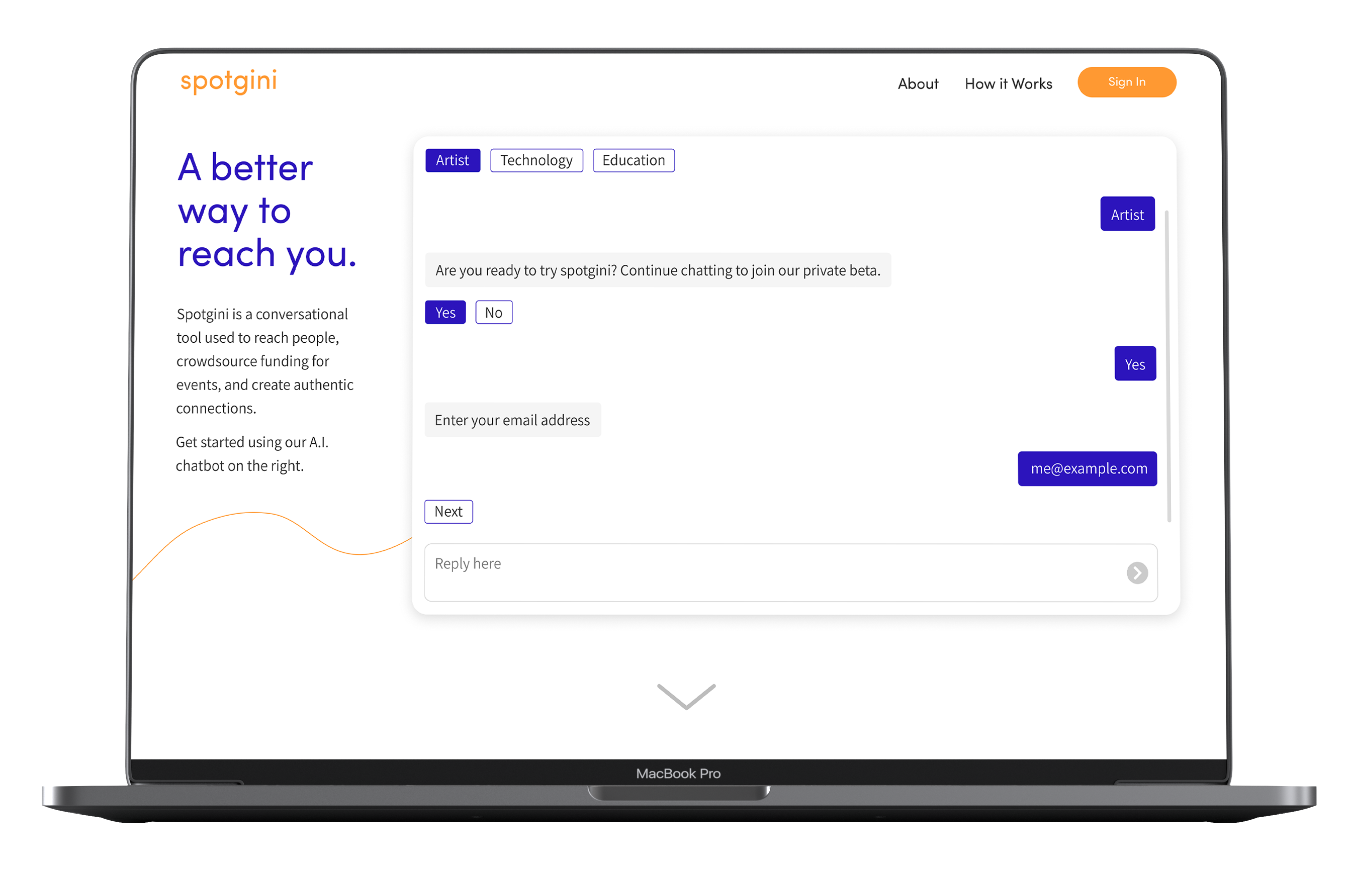
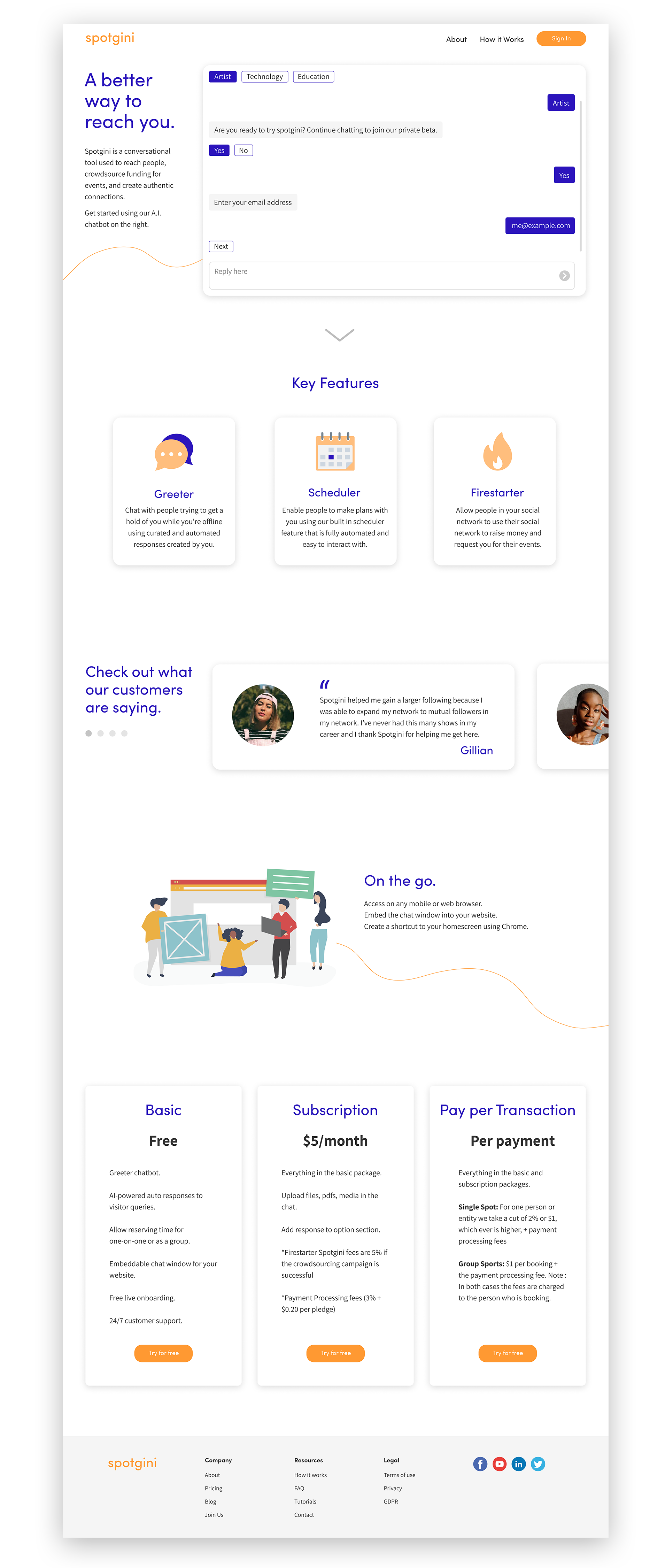
DESIGN SOLUTION
Landing Page Redesign + Rebranding
Define the product
More informative copy is presented immediately. Added a chevron to indicate more info.
Develop trust
Included testimonials for users to read and evaluate. Changed the order of questions in chat to ease discomfort in providing personal info.
Clean and modern style
Included more color, shapes, lines, and imagery to engage users and help them find important info.
Consistency
Used the same style guide and built on top of it to create a cohesive brand across all pages.
01 RESEARCH
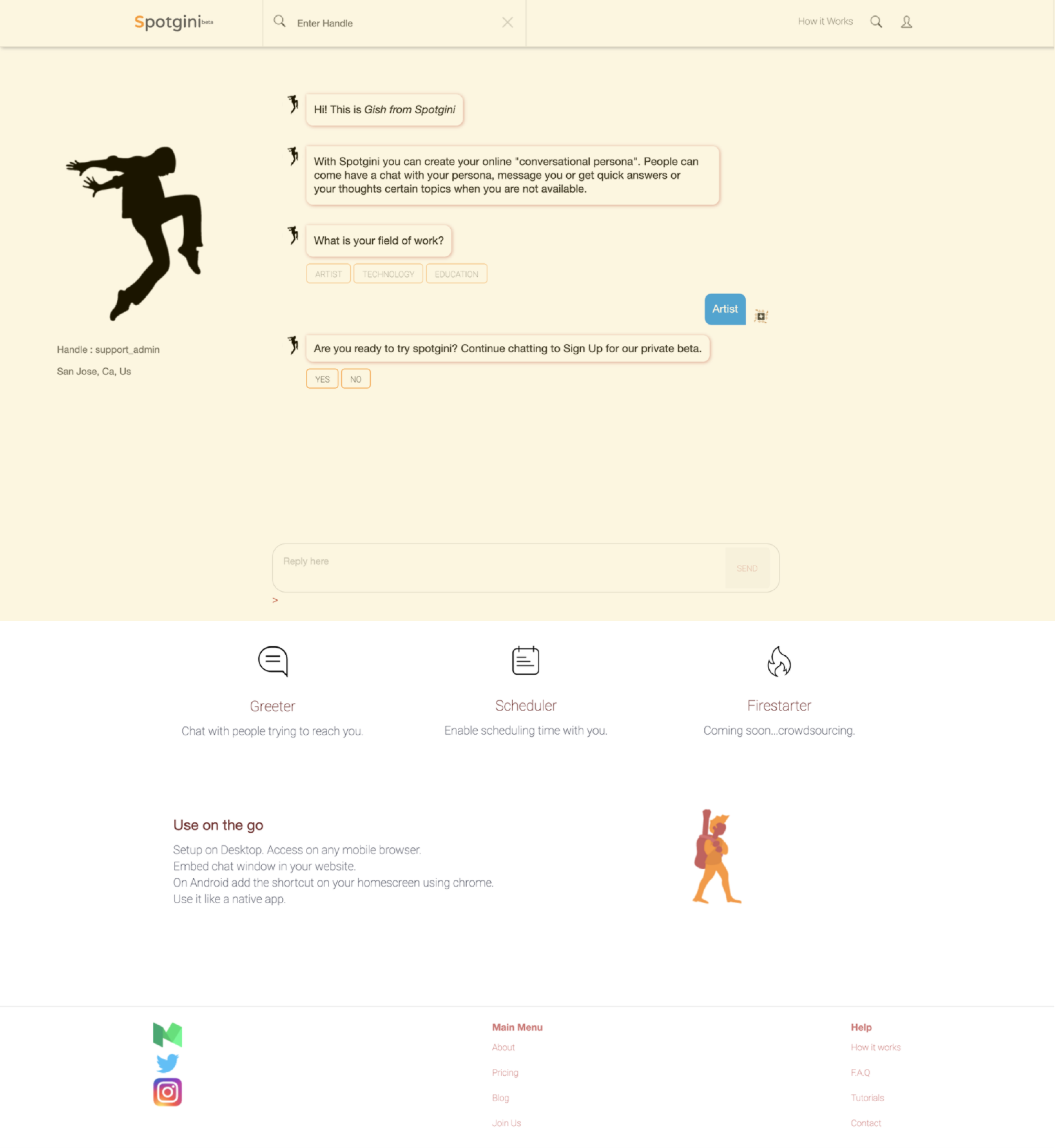
Site Evaluation
Landing Page and Onboarding Flow
No clear indication that there is more content on this page.
Style is inconsistent, spacing is off and feels unbalanced.
02 RESEARCH
Target Users
Demographic
• All genders, ages ~16-60 years old
• Range of professionals to creatives, non tech-oriented people
Needs
• Raise money for events
• Quickly schedule meetings & events
• Quickly get FAQ's answered
Pain points
• Ways to raise money for their events
• Finding people to host events
• Email back and forth is time consuming
03 RESEARCH
Usability Study and Findings
Study Overview
• Collaborated with the intern to moderate and take notes
• Tested 5 target users
• Looking at task completion rates to identify usability problems
• Asked 3 basic tasks that asked them to walk through the site, complete sign-up tasks, and think out loud
Findings
• Users had trouble understanding the purpose of the product
• Users struggled to find information about the product
• Users are hesitant to provide their personal information in chatbot
• While users are chatting with the bot, they are still unsure what the product is about
01 DESIGN
Define Needs
01
Clearly define what the product is and what it entails.
02
Develop a sense of trust with users.
03
Create a cleaner and modern style that aligns with the brand.
04
Make the landing page more consistent across the product.
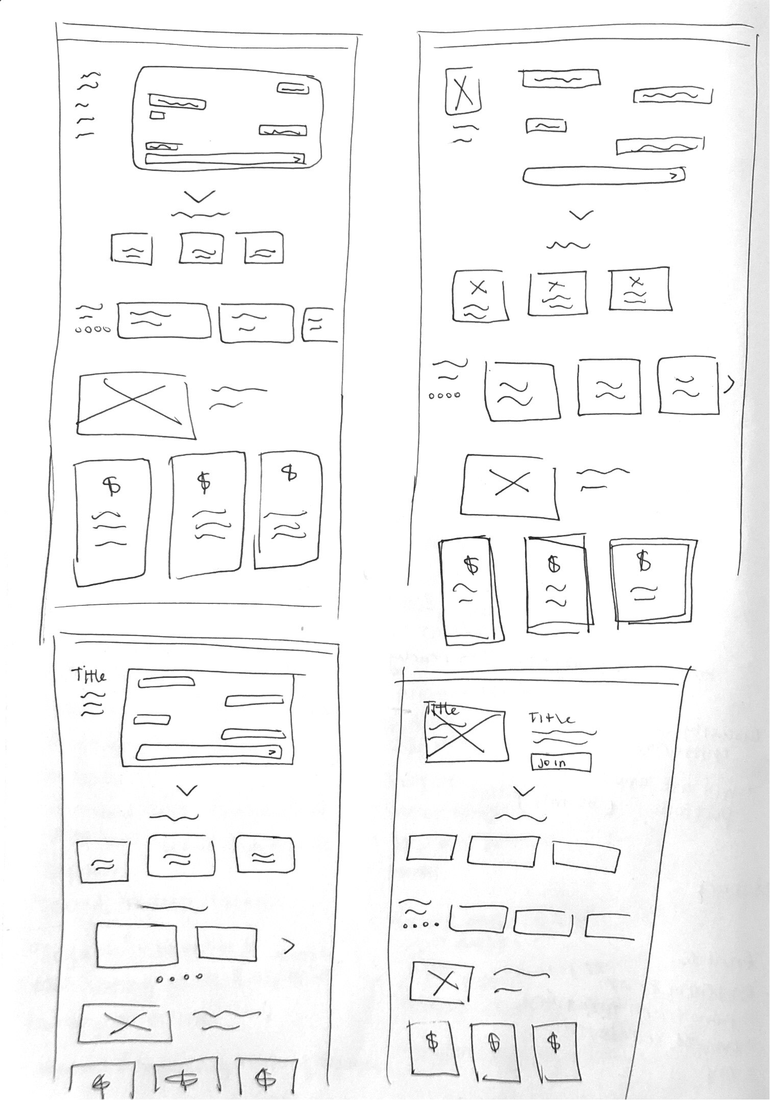
02 DESIGN
Sketches
These are some ideas I explored. They all include areas where we would be presenting the A.I. chatbot, highlighting our platform's features, showcasing testimonials to develop trust in new users, and a section about different subscription plans, which users felt was important to know before signing up.
We decided to go with #1 since it was the most viable in terms of technical feasibility and still solved for our user needs, which was to help users understand what the product is about, and how to take action in the most seamless way.
03 DESIGN
Style Guide and Rebranding
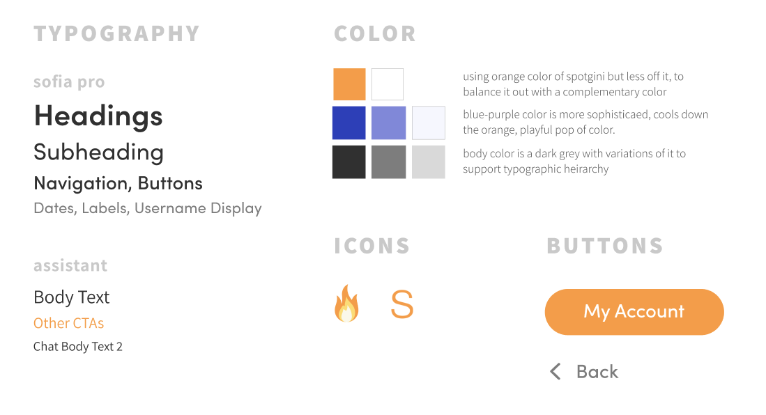
This is the style guide that would help our redesign efforts across the site. The inspiration started from the platform's original Spotgini orange.
I made most of my design choices based on the vision for the new direction for the brand, which would cater to younger audiences as well as mature ones.
With the founder's input, we decided to go with a style that represented something more inviting, helpful, friendly, playful, and modern.
04 DESIGN
Final Prototype
Intended Results & Lessons Learned
• Intend for sign up rates to grow beyond 30%
• Got better at talking to non-designers about the importance of user-centered design and gaining more buy-in
• Enjoyed mentoring and collaborating with the design intern
• In the future after release, I'd want to check the product’s analytics to see if the goal was reached, and how we could grow from there
• If I could do this again, I’d like to increase sign up rates by exploring ways users could engage with the platform through discovering artists and independent professionals to build excitement before asking them to sign up
Thanks for stopping by, let's chat!
Dianne Worku © 2023