CASE STUDY
Interact Health
This design challenge was a part of an interview process that I did during Summer 2020.
Interact Health is a technical service for doctors that allows them to focus on their patients while their technical needs for their business are taken care of. The product includes a patient engagement platform, an online reputation management service, website development service, and a custom Telehealth app to provide remote patient care.
TIMELINE
4 days
SKILLS
UX/UI design
UX research
Sketching
Wireframes
Prototyping
Visual design
DESIGN QUESTION
How might we reduce the challenge of doctors who are not technically savvy, and create a one stop shop for all the technical needs of private doctor offices?
Problems
• Some doctors are not quite technically savvy and need support to maintain their business practice
• Doctors don't have time to cover all the technical needs of their offices while taking care of patients
Goals
*The hiring manager gave me these goals that were required
• A big picture header that introduces the user to the company
• A summary of the four different features
• Testimonials
• Schedule a demo, contact or sign up area
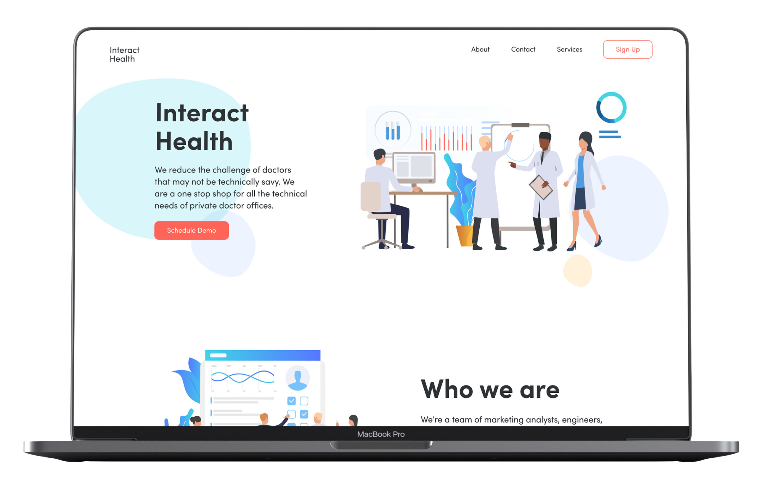
DESIGN SOLUTION
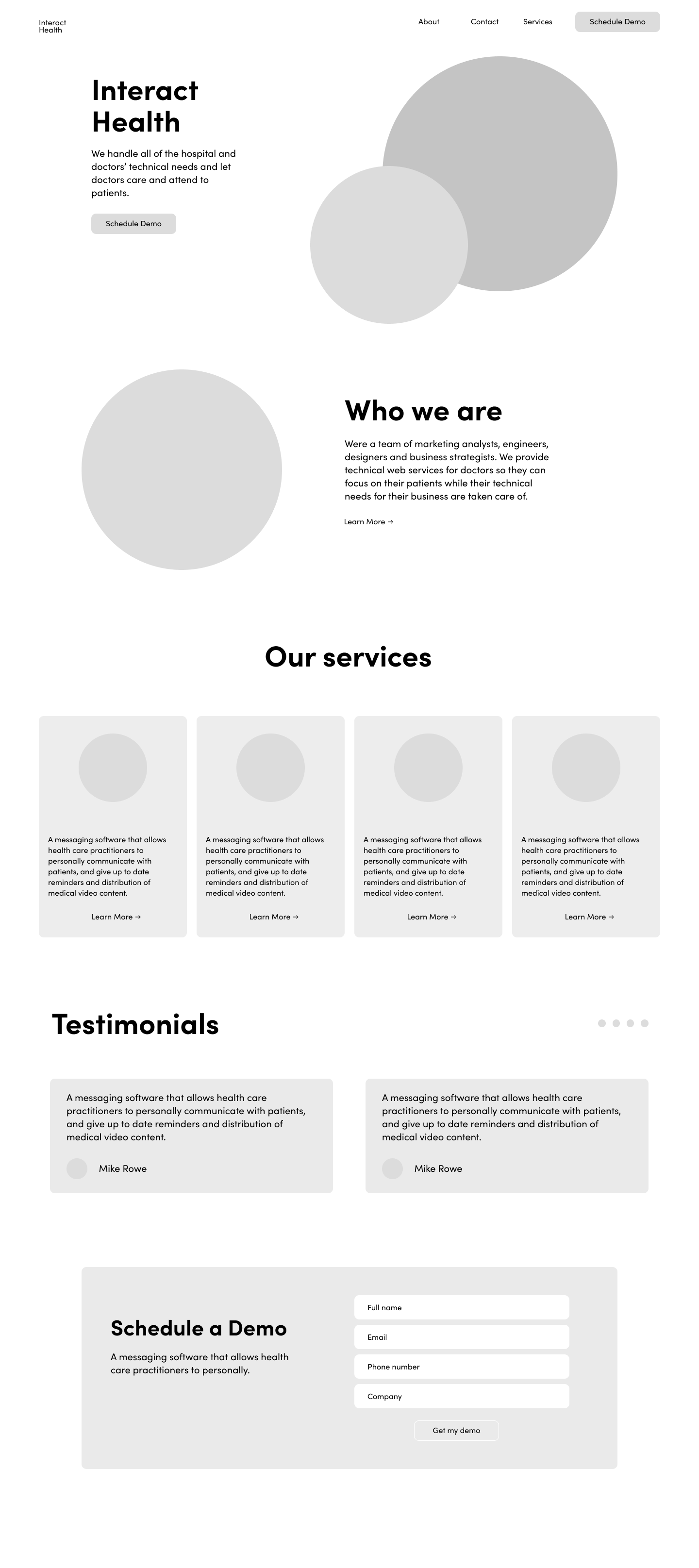
Key Features
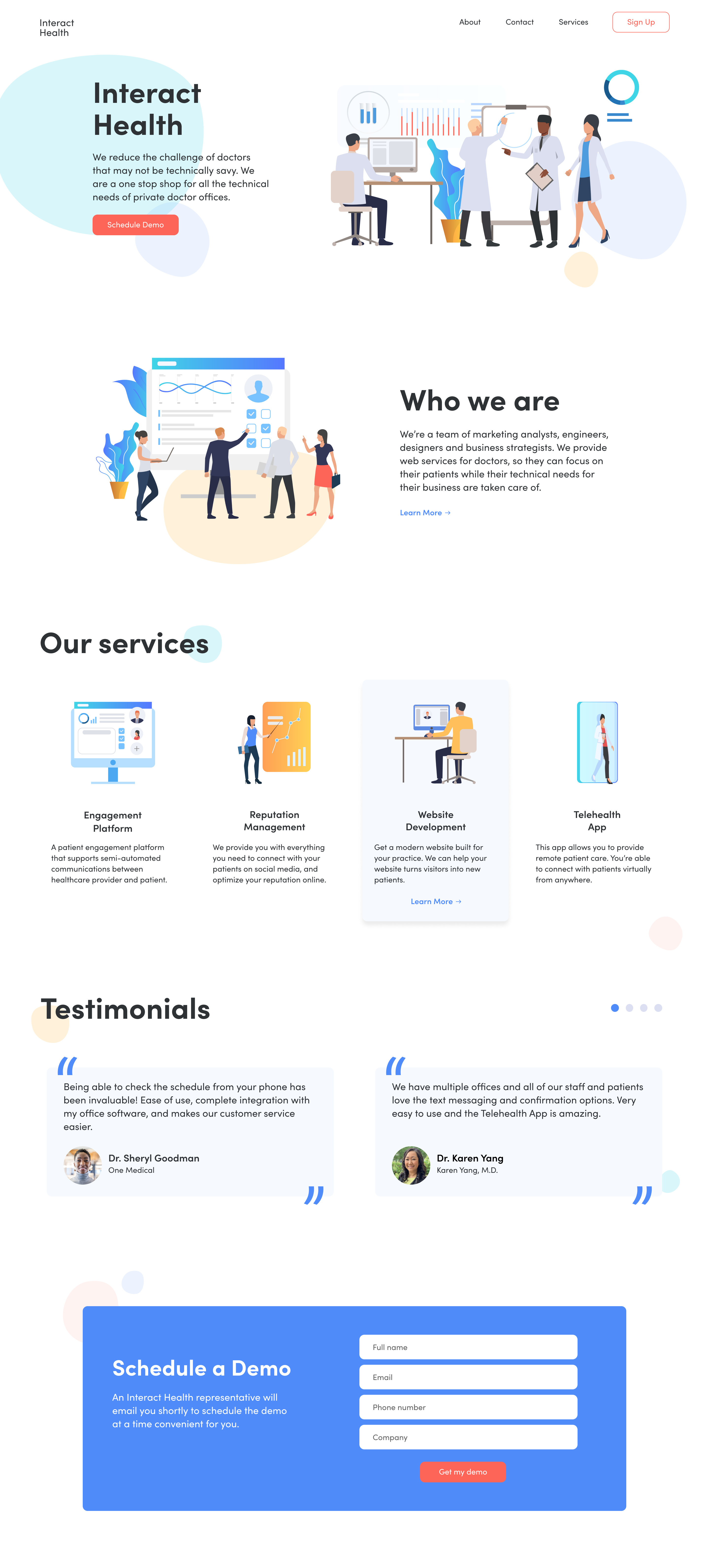
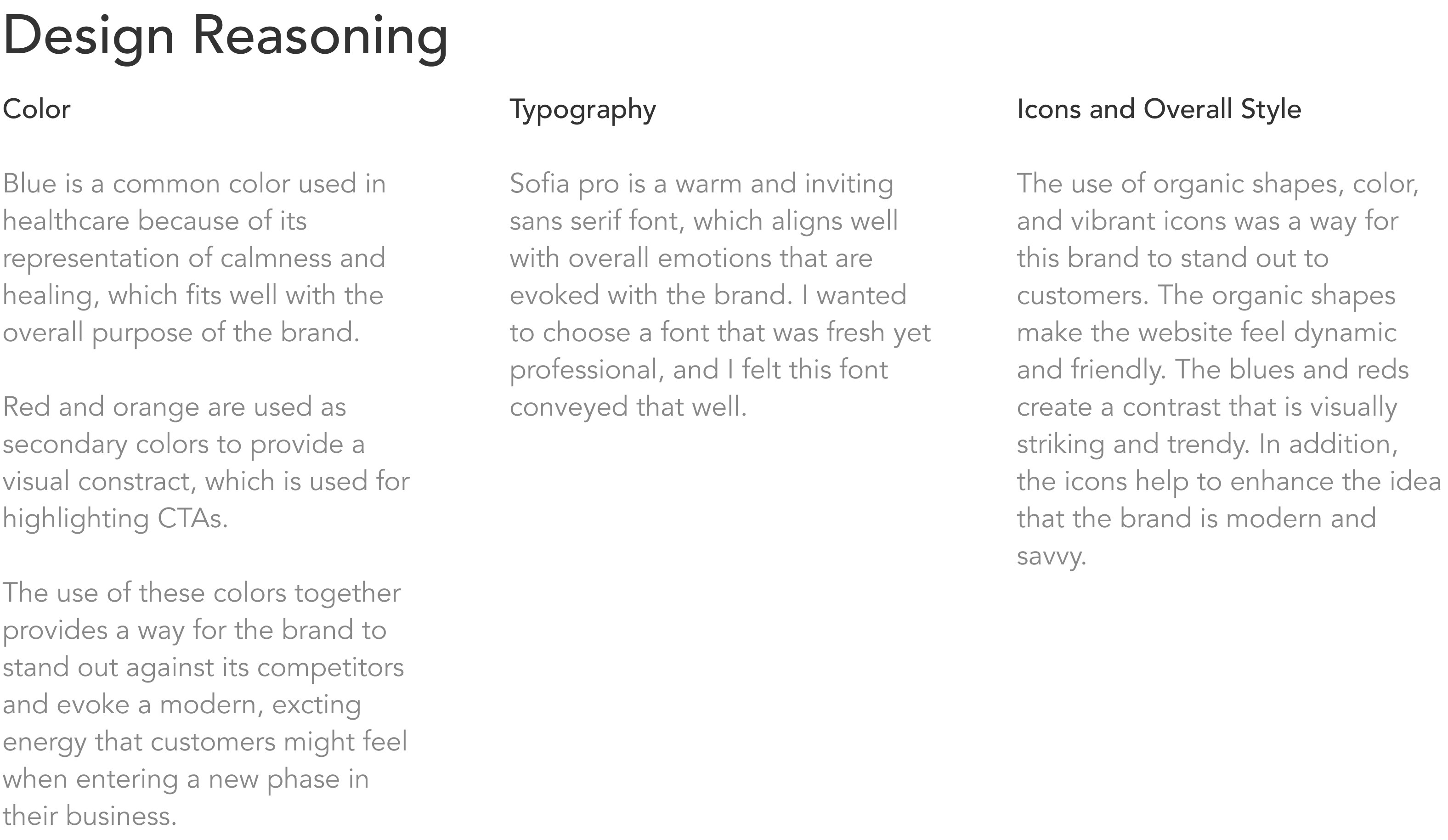
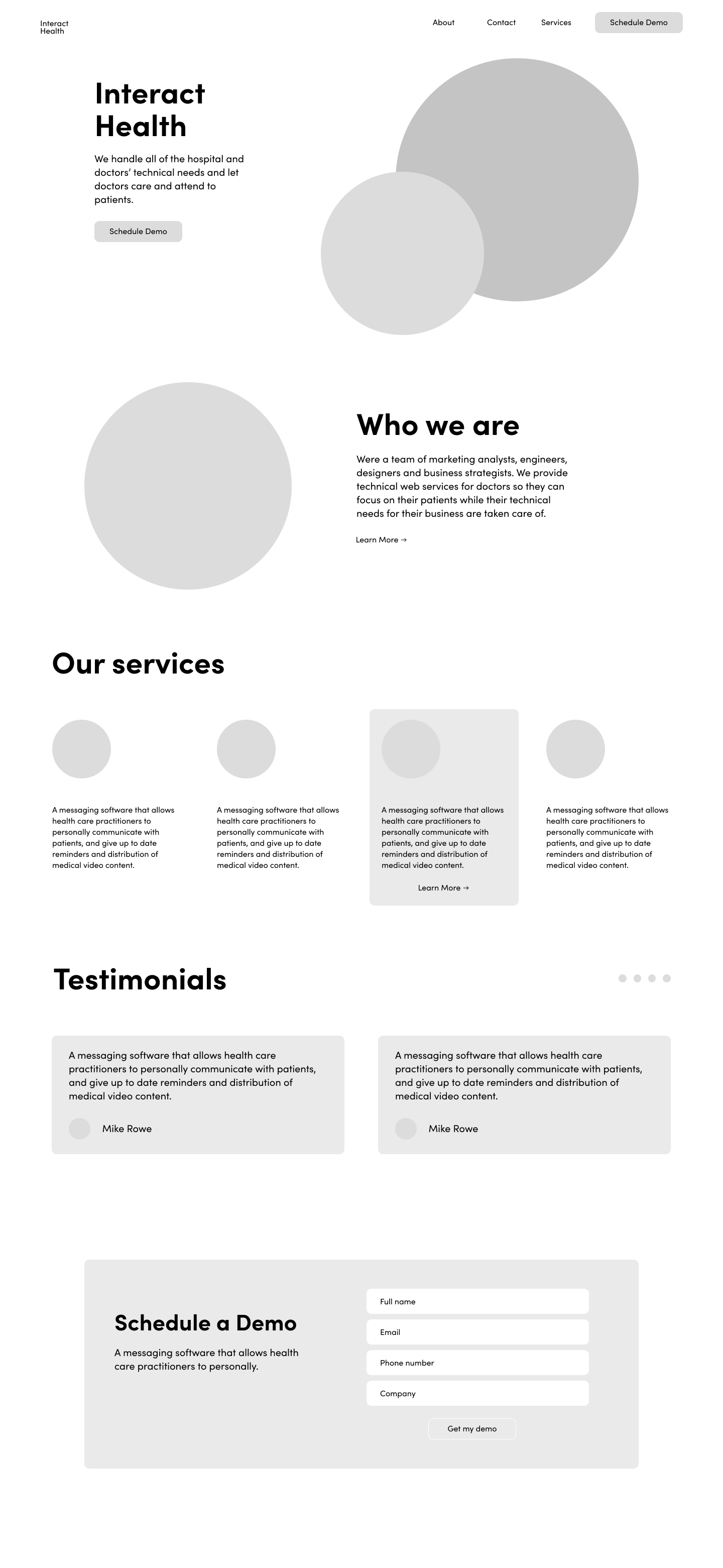
Soft, airy and modern look
I used the pastels color combinations, simple illustrations, and transparent organic shapes throughout the landing page.
Learn more about Interact Health
Right below the introduction, I added an about section to describe who the team is and what they offer. I also added a learn more CTA that could link to a full about page.
Clear value propositions
The interactive services section includes a summary of the features and illustrative descriptions.
Developing trust and credibility
I kept the testimonials section consistent with the overall color palette and maintained an airy aesthetic.
Bold Call-to-Action
I included a clear and vibrant section that would allow users to schedule a demo with the product.
01 RESEARCH
Competitive Analysis
Seasame Communication
• Good use of color and imagery
• Services are clearly displayed, but descriptions are a bit excessive
• Bold and stark contrasts make it feel like a cutting edge brand agency
• Testimonials makes it feel legitimate
• Requesting info is a side button on the grid and is not something I notice immediately
Allscripts
• Duller and more toned-down design style, feel more professional but sterile
• Unexciting grid, lack of images and color
• They don’t really define what type of business they are
• The Why Statement is defined first then Services are explained
• Their blog and insights section doesn’t help me get a lot more out of the site
• Connect button is located at the bottom
Signal Health
• Lack of visual balance, color, and imagery
• What they provide is stated for users, but their services are organized in a non-user friendly way using a carousel
• About info is located near the bottom when that’s important info for users
• Contact info provided on the bottom
• Request a demo and account buttons are located on the top
• Learn more CTA on the top just takes you to the services they provide
Well Health
• Request a demo CTA in the right-hand corner and in center of the page, and at the bottom of the page
• Subtle use of color and contrast
• Describes the impact they can make
• Shows the features that the platform provides
• Could have a stronger representation of their services
Weave
• Great use of illustrations and color, clearly defined brand identity
• Describes why you should join and then the various services they offer along with visuals
• They go into more detail about the types of services that are included with each main category
• Includes testimonials and a demo form at the bottom
Mend Family
• Good use of illustration, but the red is off-putting
• Request a demo CTA and free trial CTA in the center of the page
• Clearly defines their impact on companies
• Uses imagery and icons to describe the services they provide
• Included a calculator to show the specific impact they can make for a customer
• Includes a schedule demo form at the bottom
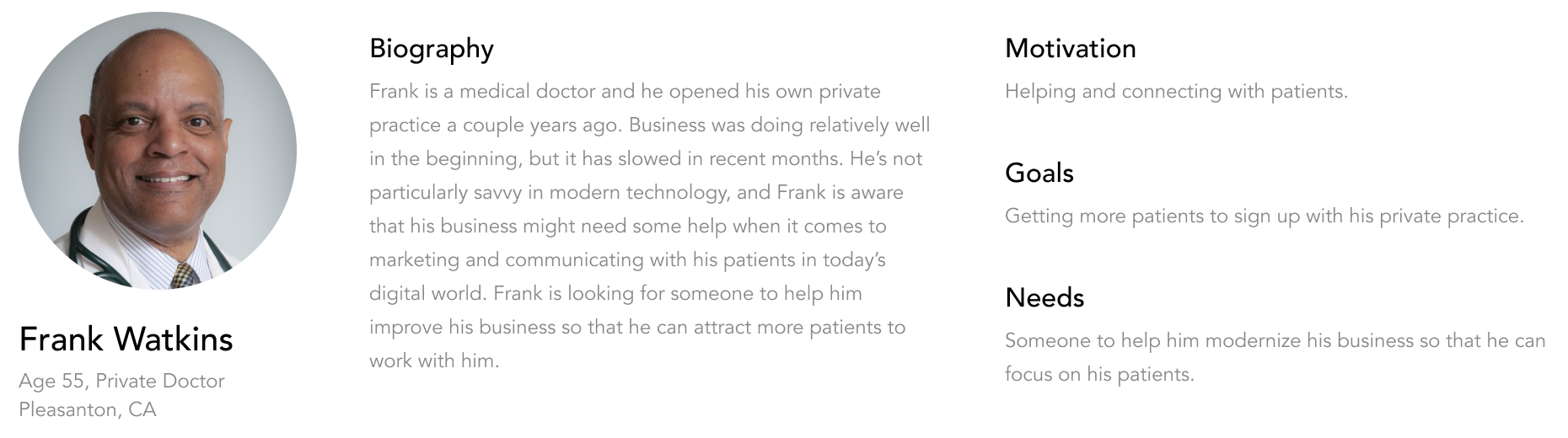
02 RESEARCH
Persona
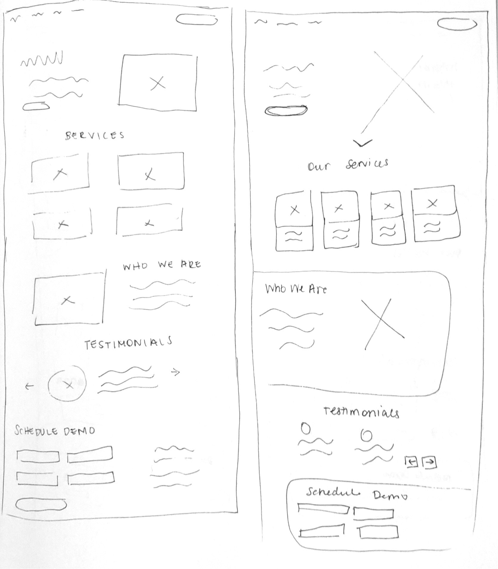
01 DESIGN
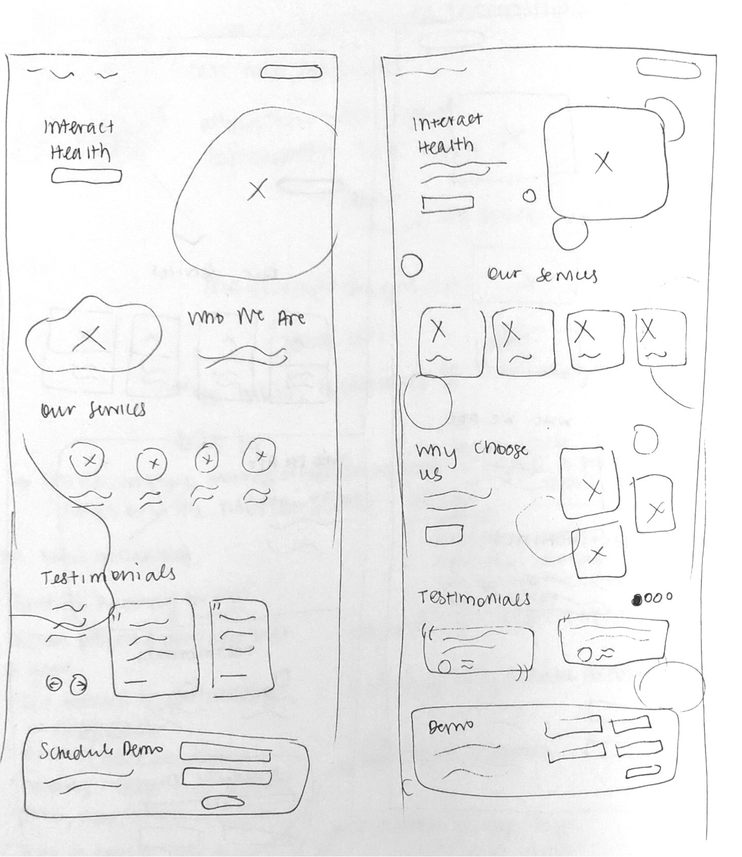
Sketches + Ideation
02 DESIGN
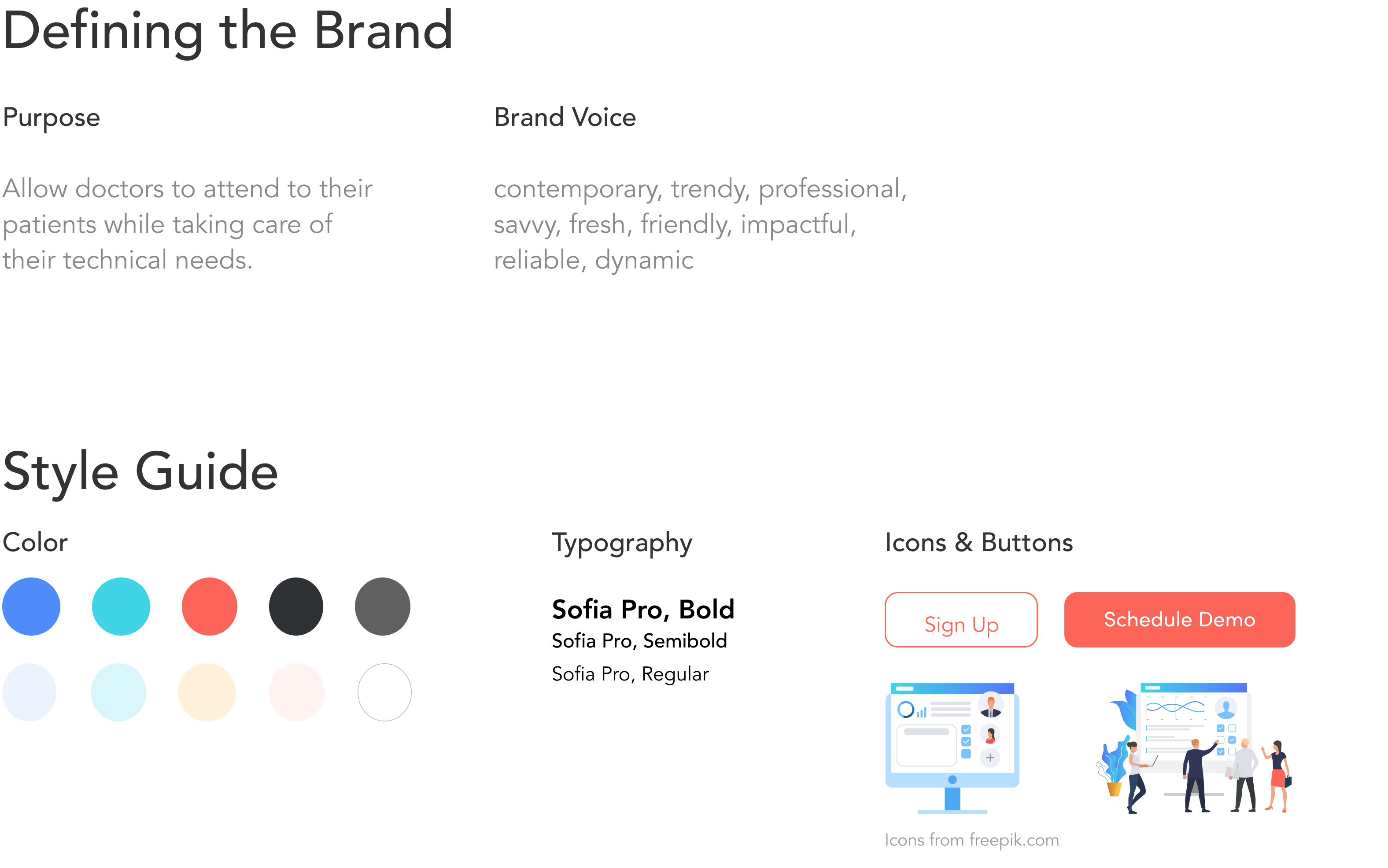
Style Guide + Branding
03 DESIGN
Lo-fi Mockups
Based on the branding exercise, I knew I wanted to go with an airy, soft and modern aesthetic.
Final Prototype
Takeaways
This was one of my favorite designs to create because I had a lot of creative freedom in this project. In order to move forward, I would work on creating some of the other key pages in the user flow and then start testing the prototype.
Thanks for stopping by, let's chat!
Dianne Worku © 2023